Exploratory Data Analysis
Shiny App
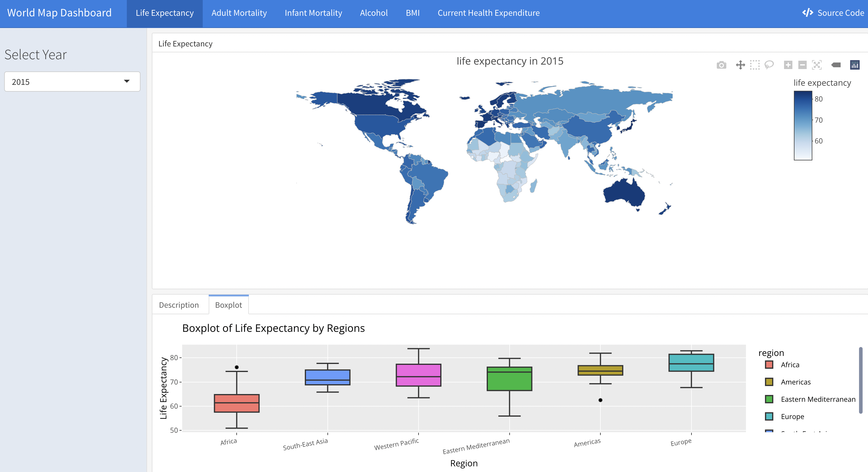
Life expectancy as well as other included variables changes over decades. A way of seeing the trend is via shiny app here) developed by our teammate, which illustrates the life expectancy for individual countries in the world wide scale. A screen shot is as following:
Time series plot
With our existence data, we need to evaluate the overall trend with respect to different types of countries. One way to differentiate country is to identify that whether the country is classified as developed or developing country. In the work by SP Heyneman, he claimed that the change of economic status and school has a big difference between developed and developing country. We treat these variables as our predictors to the life expectancy. Therefore, it is likely that the predictors are different between developed and developing country. On the other hand, people with different income have different life expectancy. According to Chatty et. al., the richest 1% income group has a 14.6 years and 10.1 years higher life expectancy for men and women respectively against the poorest 1% of income group. Therefore, we plot the trends for different variables over time with respect to development of the country and income group of the country.
merged_data =
  read_csv("data/Merged_expectation.csv", show_col_types = FALSE)

imputed_data = read_csv("data/Imputed_expectation.csv", show_col_types = FALSE)
Time_series_plot = function(variable,merged_data){
merged_data %>%
group_by(year, `Developed / Developing Countries`) %>%
summarize_at(variable,mean,na.rm=TRUE) %>%
pivot_wider(
values_from = variable,
names_from = `Developed / Developing Countries`
) %>%
ggplot()+
geom_line(aes(x=year, y=Developed, color='a'))+
geom_line(aes(x=year, y=Developing, color='b'))+
scale_color_manual(name = ' ',
values =c("a"='black',"b"='red'),
labels = c('Developed','Developing'))+
geom_point(aes(x=year, y=Developed, color='a'),shape=19,size = 3)+
geom_point(aes(x=year, y=Developing, color='b'),color = "red", shape=19,size = 3)+
labs(title = sprintf("Time series plot for %s (develop)", variable) )+
xlab("Year")+
ylab(sprintf("%s",variable))
}
Time_series_income = function(variable,merged_data){
merged_data %>%
group_by(year, income_group) %>%
summarize_at(variable,mean,na.rm=TRUE) %>%
pivot_wider(
values_from = variable,
names_from = income_group
) %>%
janitor::clean_names() %>%
ggplot()+
geom_line(aes(x=year, y=high_income, color='a'))+
geom_line(aes(x=year, y=upper_middle_income, color='b'))+
geom_line(aes(x=year, y=lower_middle_income, color='c'))+
geom_line(aes(x=year, y=low_income, color='d'))+
scale_color_manual(name = ' ',
values =c("a"='black',"b"='red',"c"='blue',"d"='purple'),
labels = c('High','Upper middle','Lower middle','Low'))+
geom_point(aes(x=year, y=high_income, color='a'),shape=19,size = 3)+
geom_point(aes(x=year, y=upper_middle_income, color='b'),color = "red", shape=19,size = 3)+
geom_point(aes(x=year, y=lower_middle_income, color='c'),color = "blue", shape=19,size = 3)+
geom_point(aes(x=year, y=low_income, color='d'),color = "purple", shape=19,size = 3)+
labs(title = sprintf("Time series plot for %s (income)", variable) )+
xlab("Year")+
ylab(sprintf("%s",variable))
}
ts1 = Time_series_plot("une_life",merged_data)
ts2 = Time_series_income("une_life",merged_data)
plot_grid(ts1, ts2)
Life expectancy as our dependent variable has similar trends for both developed and developing countries. Two life expectancy indices have a persistent increase over time. However, the expectancy for developed countries is 10 years higher than the developing countries over 16 years. The similar trends also holds for different income groups but countries classified in low income group has a higher growth rate for life expectancy than other groups.
ts1 = Time_series_plot("adult_mortality",merged_data)
ts2 = Time_series_income("adult_mortality",merged_data)
plot_grid(ts1, ts2)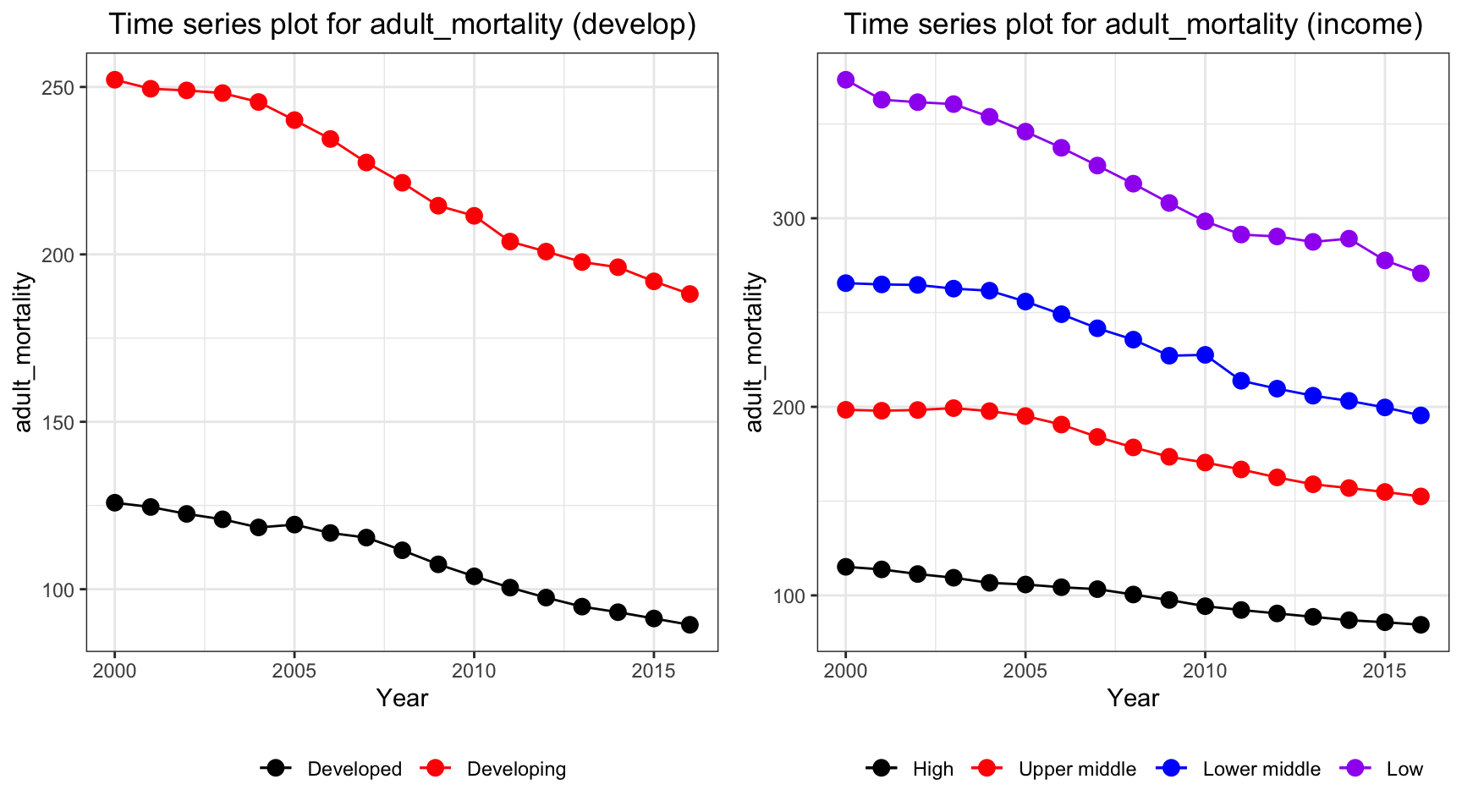
Adult mortality has a similar trend with life expectancy, but in a reversed order. The mortality rate in developing and low income countries decreases with a higher rate than developed and high income countries.
ts1 = Time_series_plot("alcohol",merged_data)
ts2 = Time_series_income("alcohol",merged_data)
plot_grid(ts1, ts2)
Alcohol seems to have a stable trends for all countries. However, alcohol consuption in developed countries have a much higher value than developing country, and countries classified as high and upper middle income have a higher alcohol consuption value than lower middle and low income, where countries in the latter two two categories have a value of 2 bottles per capita.
ts1 = Time_series_plot("bmi",merged_data)
ts2 = Time_series_income("bmi",merged_data)
plot_grid(ts1, ts2)
Over years, bmi for most of countries increases and countries in different categories all increases regardless of development and income group of the country. Interestingly, upper middle income countries exceed the bmi for high income countries, whereas low income countries has a by far lower value than other countries. Also, developing countries has a higher rate of increase as indicated by a steeper line (higher tangent) according to the time series plot.
ts1 = Time_series_plot("measles",merged_data)
ts2 = Time_series_income("measles",merged_data)
plot_grid(ts1, ts2)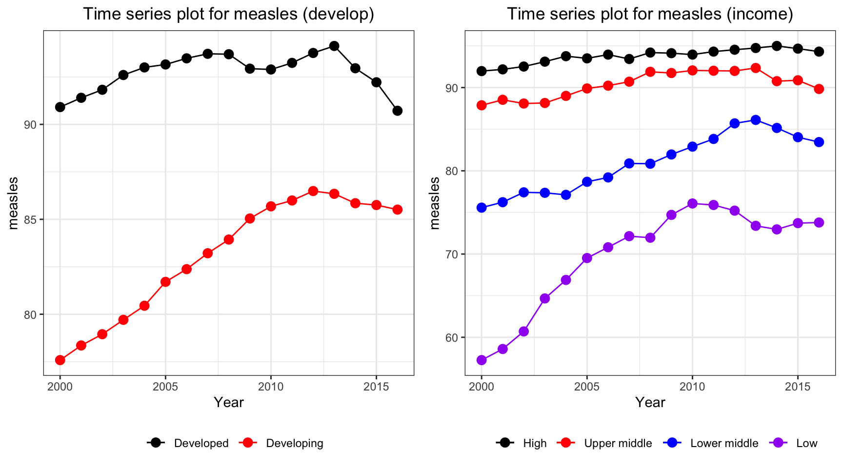
Measles vaccination coverage increases for developing countries and developed countries have a persistently high vaccination coverage. On the other hand, developing countries and low income countries has a soar in vaccination coverage over the time period.
ts1 = Time_series_plot("age5_19obesity",merged_data)
ts2 = Time_series_income("age5_19obesity",merged_data)
plot_grid(ts1, ts2)
Although due to the development over time period, the problem obesity worsen and increases over all countries. Upper middle income and developing countries have a higher increase in obesity rate.
ts1 = Time_series_plot("basic_water",merged_data)
ts2 = Time_series_income("basic_water",merged_data)
plot_grid(ts1, ts2)
Time series plot for basic water indicates an increase in percentage of people getting basic water over time for developing and lower income countries. On the other hand, high income and developed countries have a constant high basic water coverage.
ts1 = Time_series_plot("doctors",merged_data)
ts2 = Time_series_income("doctors",merged_data)
plot_grid(ts1, ts2)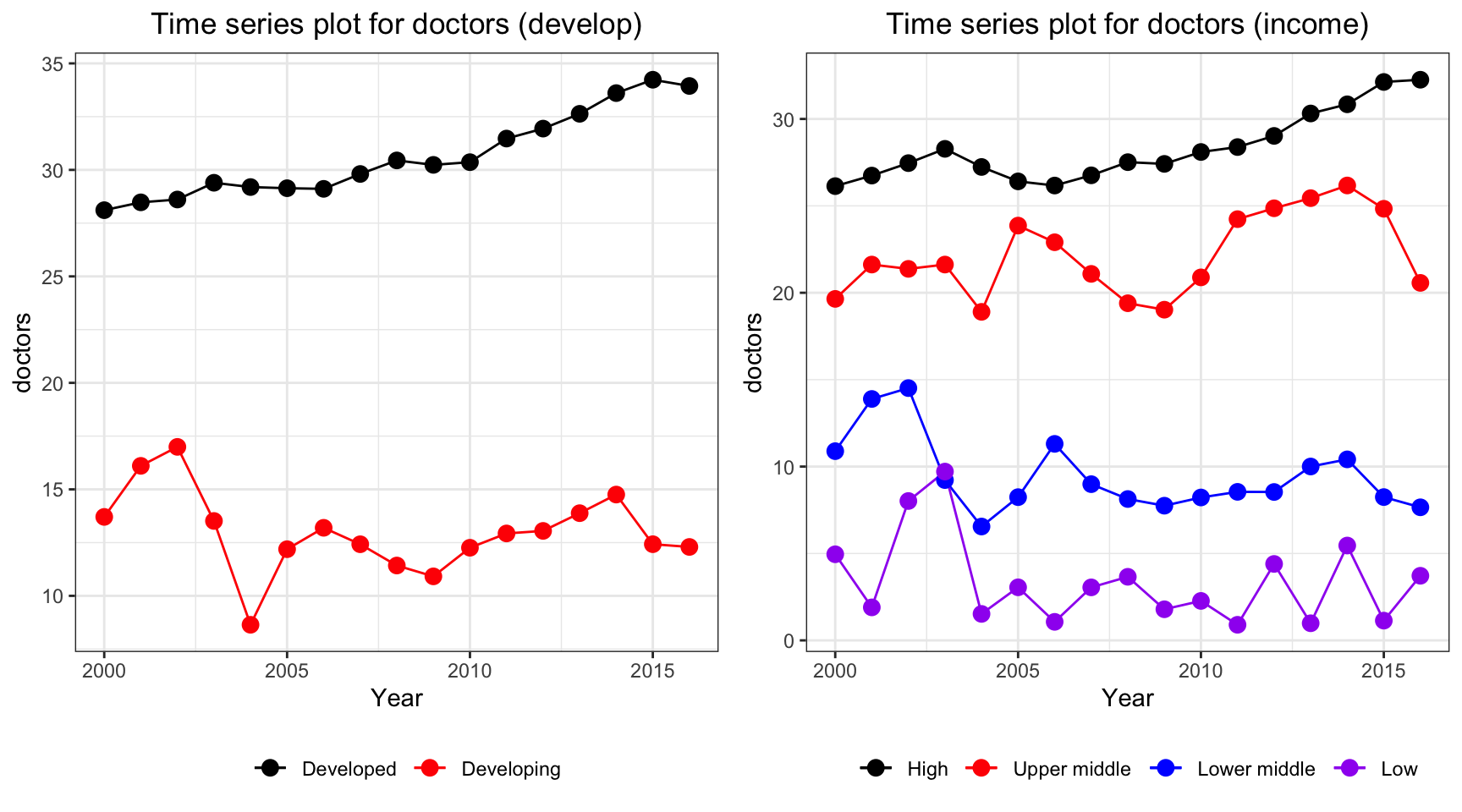
Time series plot for doctors per 10,000 people has interesting trends. Despite the constant increase in high income countries and developed countries, other countries seems to have a fluctuation over the period. There is a sudden decrease in 2004 where SARS explodes. As a result by Magdalena et. al., there are 48.94% of the doctors treated infected patients and 7.4% of the doctors were confirmed infected during the first 6 month period. This could potentially lead to death of doctors in lower middle income, low income and developing countries.
ts1 = Time_series_plot("une_edu_spend",merged_data)
ts2 = Time_series_income("une_edu_spend",merged_data)
plot_grid(ts1, ts2)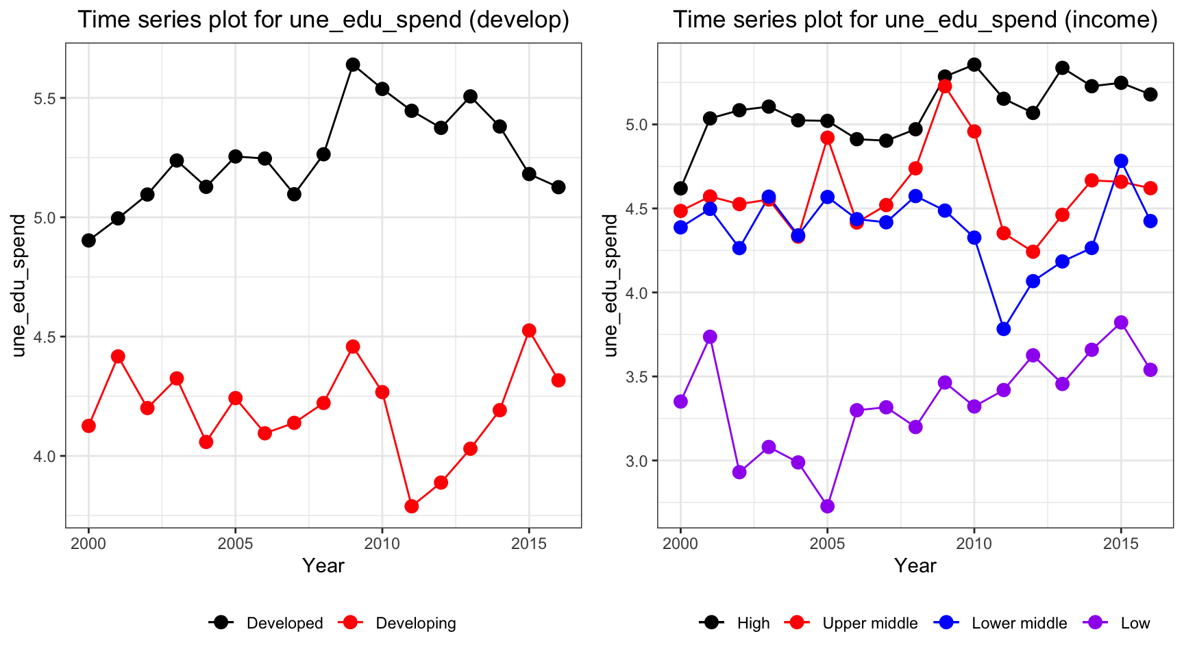
Education expenditure for all countries varies. High and developed countries have the highest expenditure among all countries over all years.
ts1 = Time_series_plot("une_gni",merged_data)
ts2 = Time_series_income("une_gni",merged_data)
plot_grid(ts1, ts2)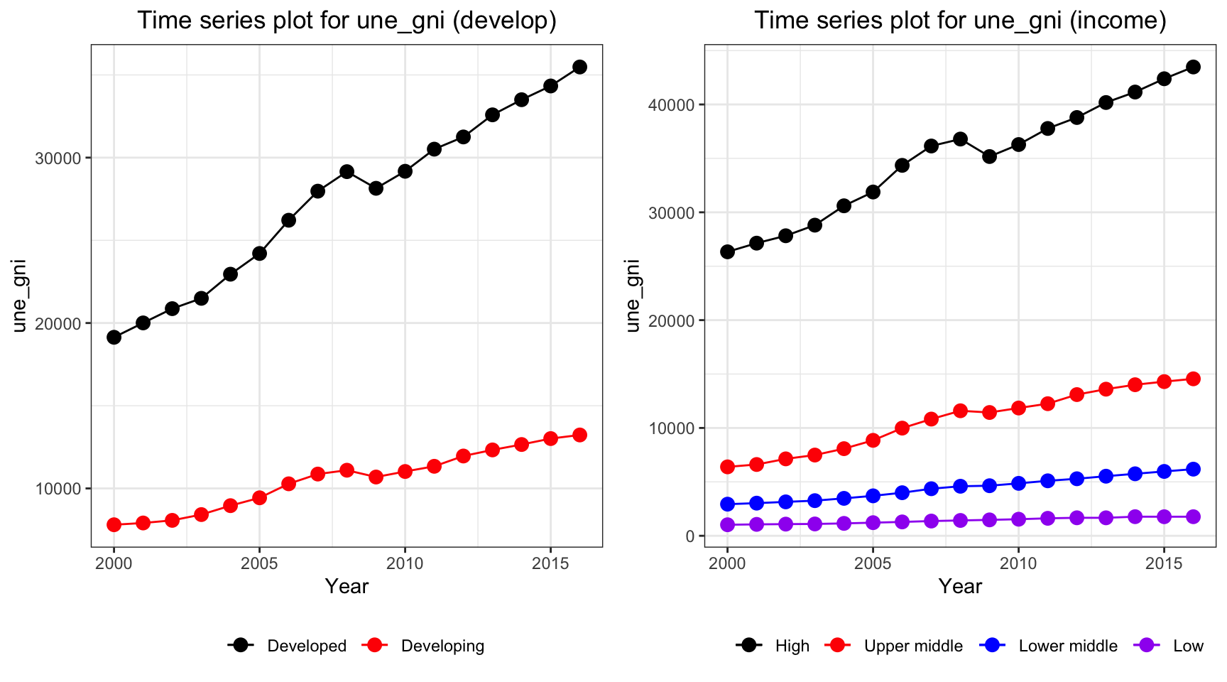
The gni is different for developed and developing country over the year. While developing countries have a relative stable curve at 10000 dollar per capita, developed countries increases from 20000 dollar to 40000 dollar per capita. On the other hand, gni per capita for high income countries, which exceeds 40000 dollar per capita in year 2013, have by far the highest value among other countries.
ts1 = Time_series_plot("une_pop",merged_data)
ts2 = Time_series_income("une_pop",merged_data)
plot_grid(ts1, ts2)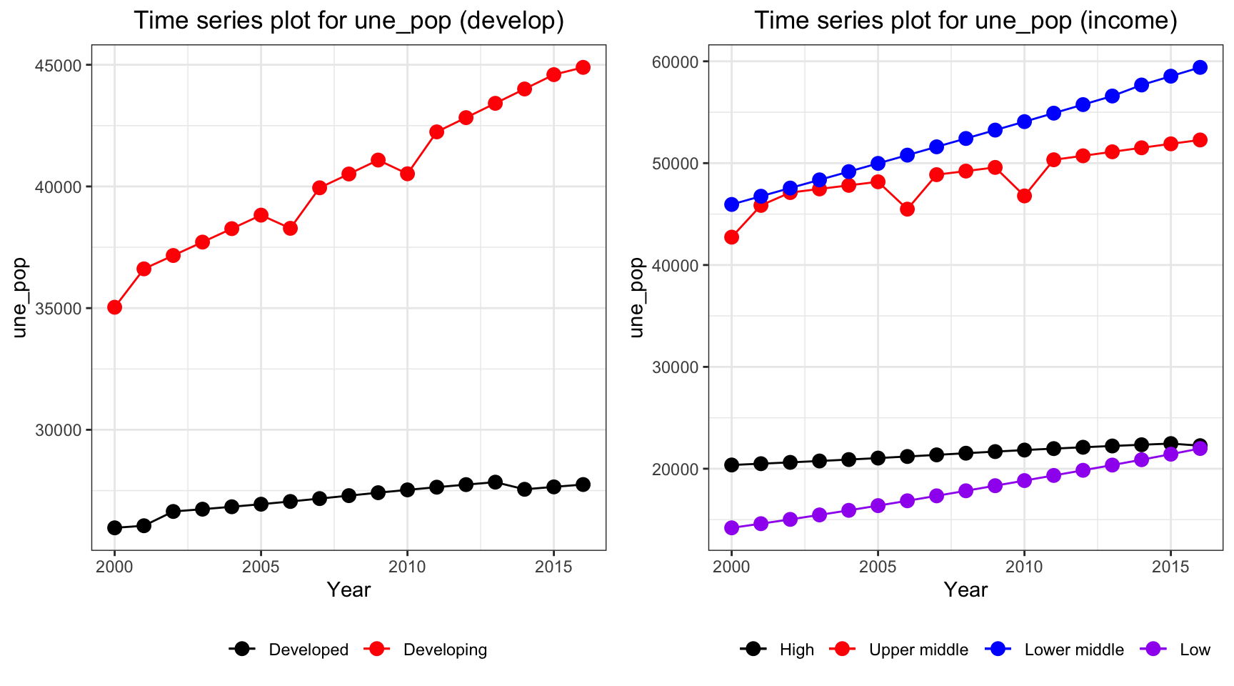
The population in developing countries is much higher than population in developed countries. Interestingly, when we consider the population among different income groups, we can see that lower middle income countries have the highest population, whereas low income countries and high income countries both have value around 20,000,000.
ts1 = Time_series_plot("une_literacy",merged_data)
ts2 = Time_series_income("une_literacy",merged_data)
plot_grid(ts1, ts2)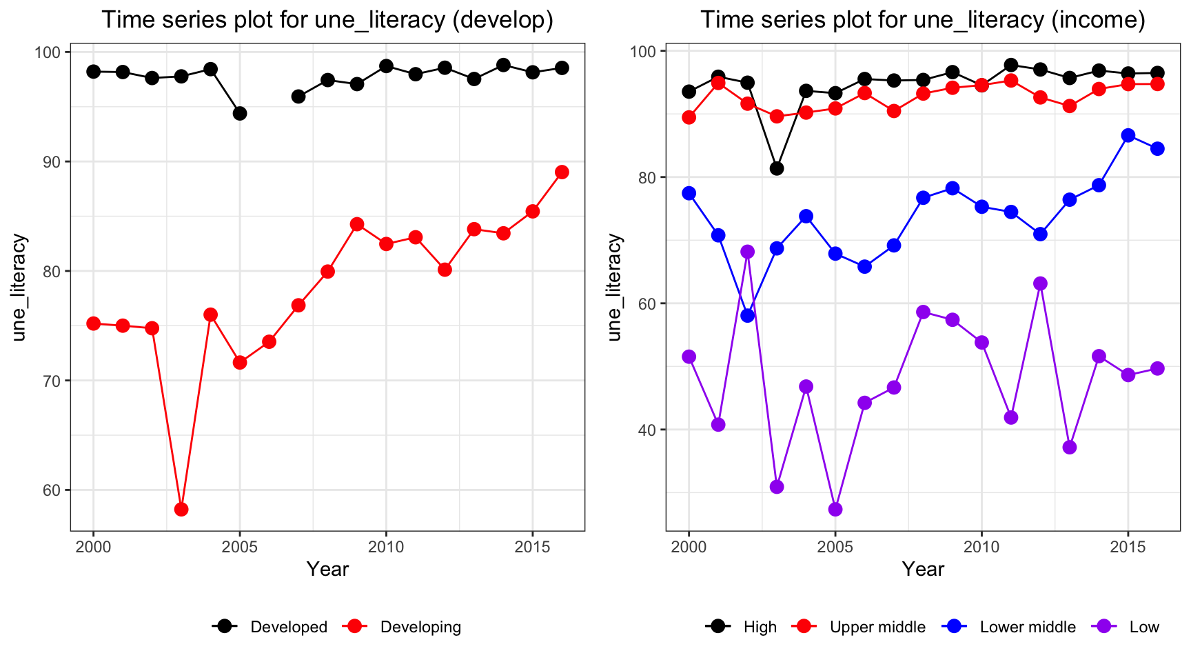
The literacy coverage has some missing value. In particular, all developed countries have a missing value in year 2006. But as indicated in the plots, literacy coverage is higher in developed and high income countries. Additionally, developing countries have an increasing trend in literacy whereas low income countries have a fluctuation but a non increasing or decreasing trend.
ts1 = Time_series_plot("PM_value",merged_data)
ts2 = Time_series_income("PM_value",merged_data)
plot_grid(ts1, ts2)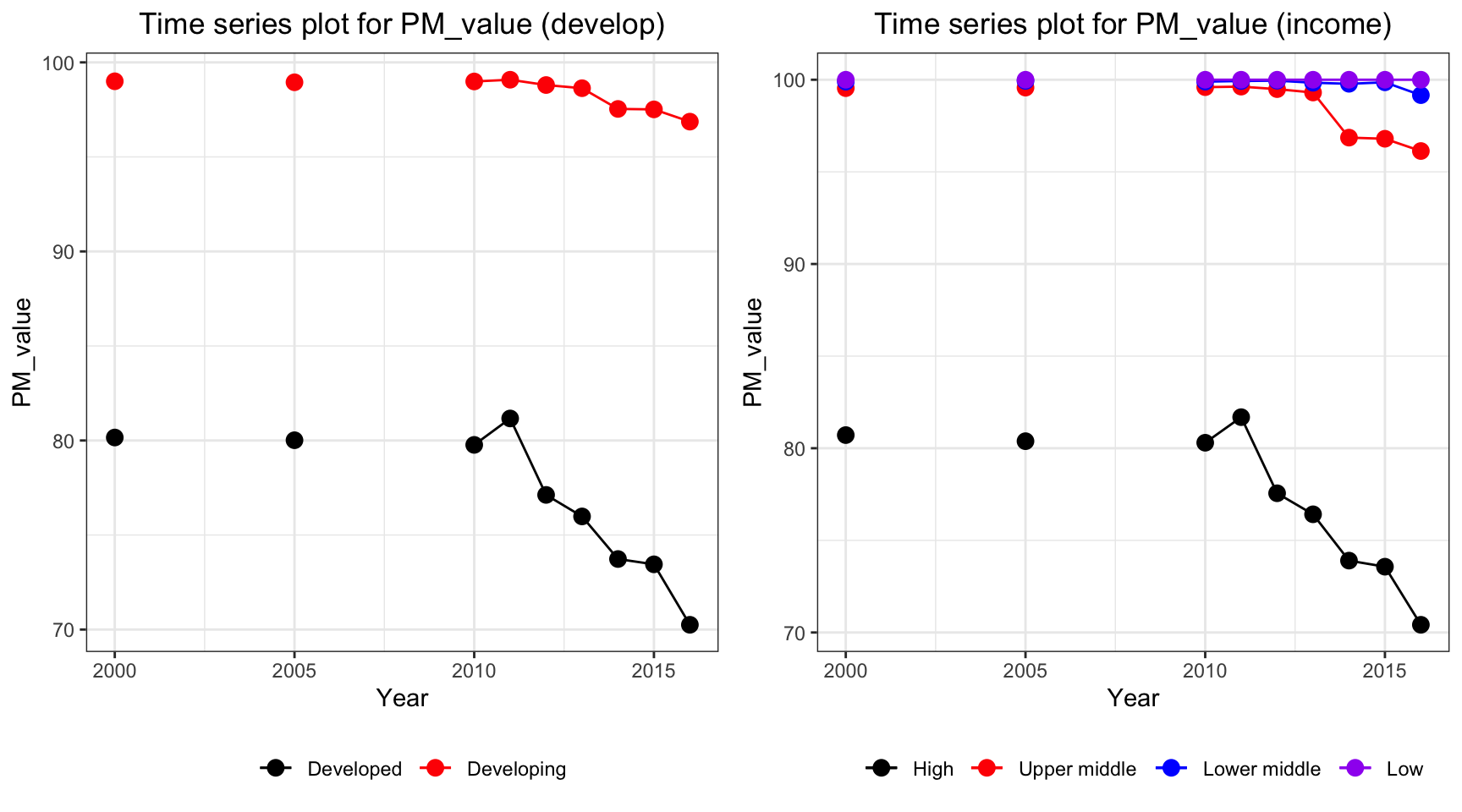
Consider only non-missing data, PM value decreases for high and developed countries. The countries with low and lower middle income have a persistent high PM value over the periods, with approximately 100 percentage of total population exposed to levels exceeding WHO guideline value.
ts1 = Time_series_plot("gghe_d",merged_data)
ts2 = Time_series_income("gghe_d",merged_data)
plot_grid(ts1, ts2)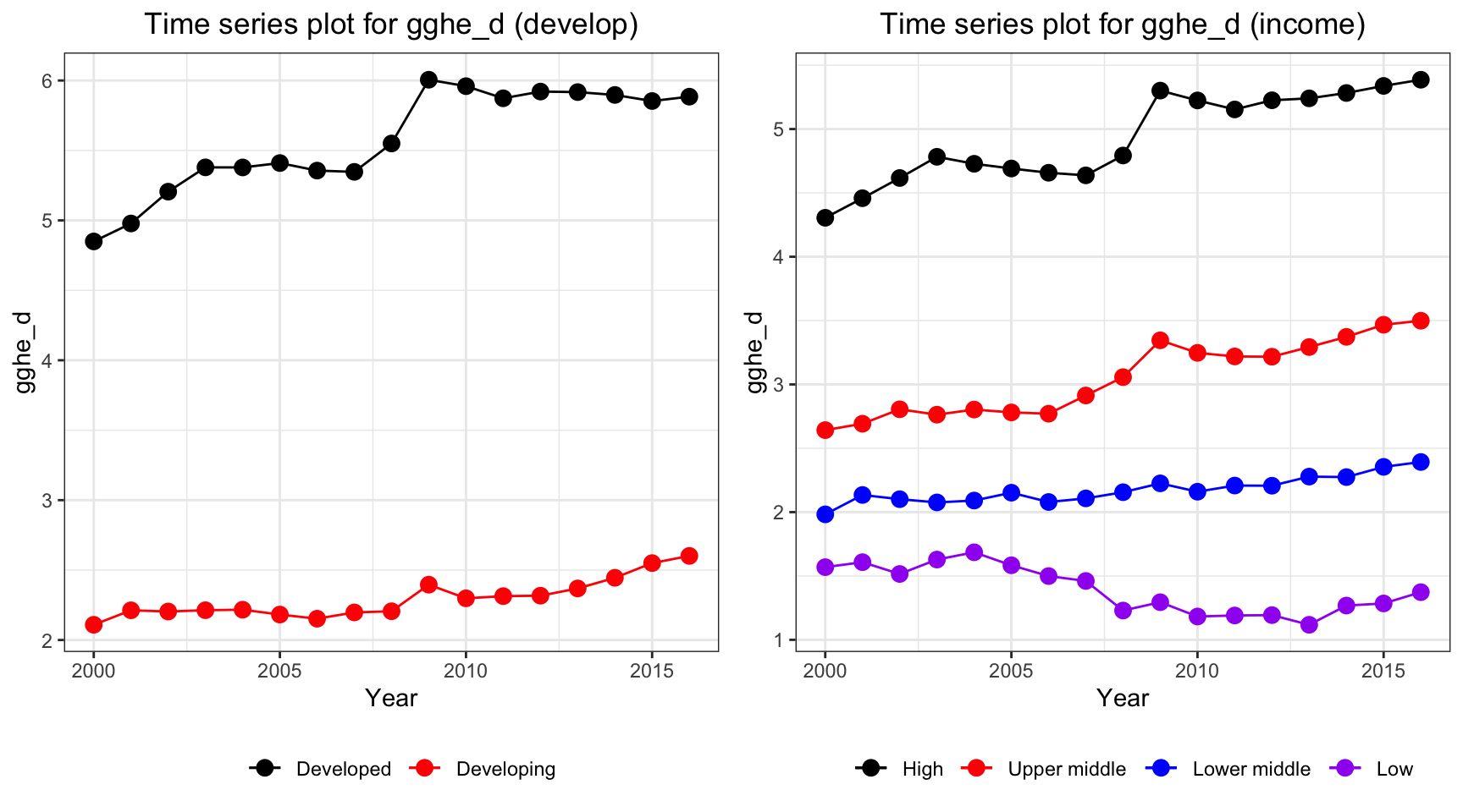
Health expenditure in developed countries soar over the years from 2000 to 2016, from 4% to 5% of total GDP. Developing countries also have an increase in the health expenditure, but with a lower rate. For different income level, high income countries have the highest expenditure on health and it has an increasing trend. However, health expenditure measured in percentage of GDP decreases among low income countries.
Multi-colinearity Check
First, we shall check the multi-colinearity between predictors. This is because multi-colinearity can cause huge swing in coefficient estimates and reduce the precision of estimated coefficients (ref). The correlation heat map is able to help us identify the existence of multi-colinearity among chosen predictors.
mortality_correlation = merged_data %>%
  select(adult_mortality, infant_mort, age1_4mort, une_life)
res = cor(mortality_correlation)
corrplot(res, type = "upper", order = "hclust",
         tl.col = "black", tl.srt = 45)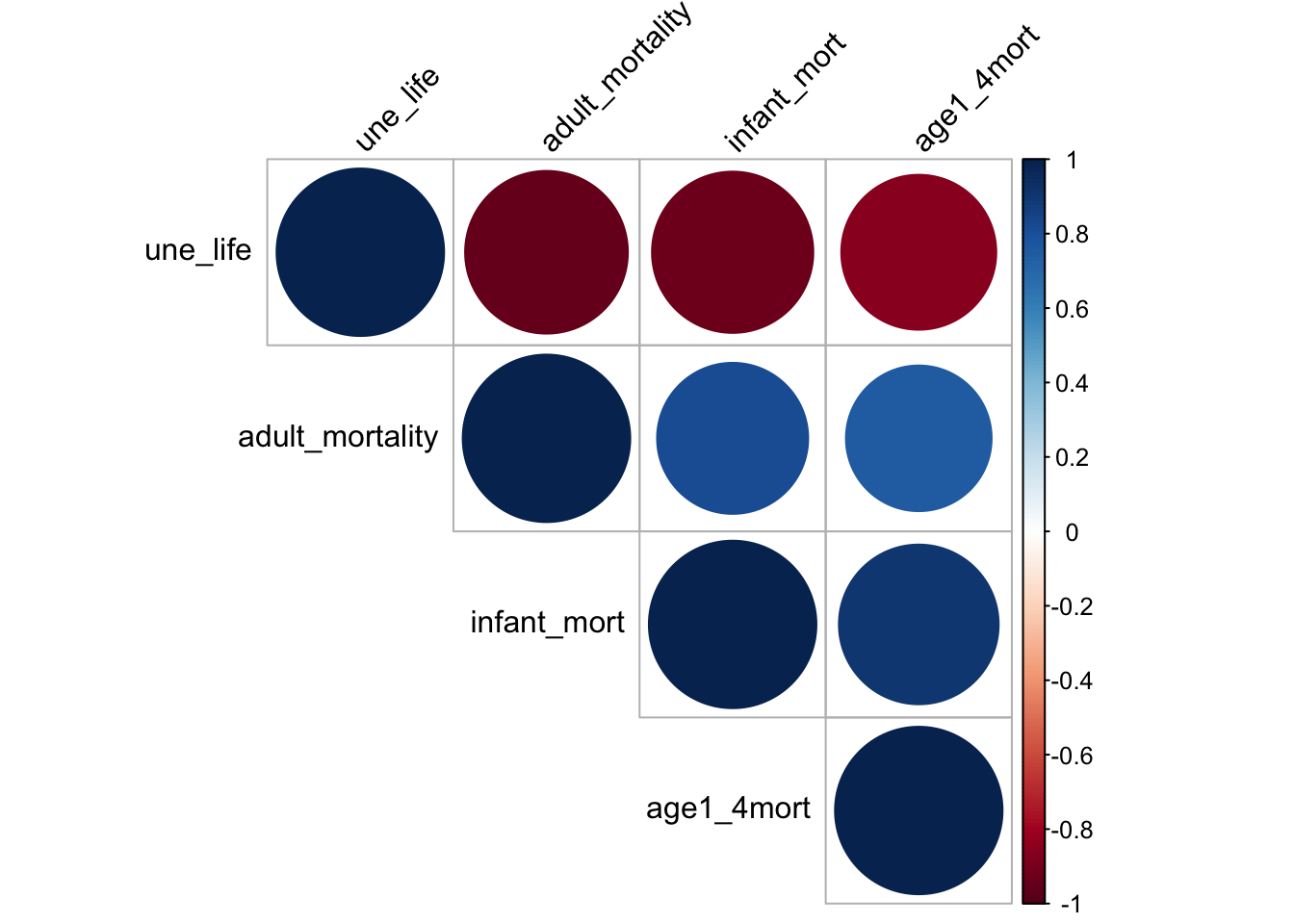
heat map shows that the chosen factors, namely mortality, life_expectancy are very correlated. Mortality is negatively correlated to une life expectancy and it is directly correlated to infant mortality and mortality for children from age 1 to 4. This may because life expectancy is calculated based on mortality rate. Although linear relation can perfectly explain the two relation, it is not a good idea to include such variable as it is directly a variable for calculating life expectancy. Therefore, it is not a good idea to include mortality as our predictor.
disease_correlation = merged_data %>%
  select(hepatitis, measles, polio, diphtheria) %>%
  na.omit()

res = cor(disease_correlation)
res
## hepatitis measles polio diphtheria
## hepatitis 1.00 0.68 0.69 0.72
## measles 0.68 1.00 0.90 0.89
## polio 0.69 0.90 1.00 0.96
## diphtheria 0.72 0.89 0.96 1.00corrplot(res, type = "upper", order = "hclust",
tl.col = "black", tl.srt = 45)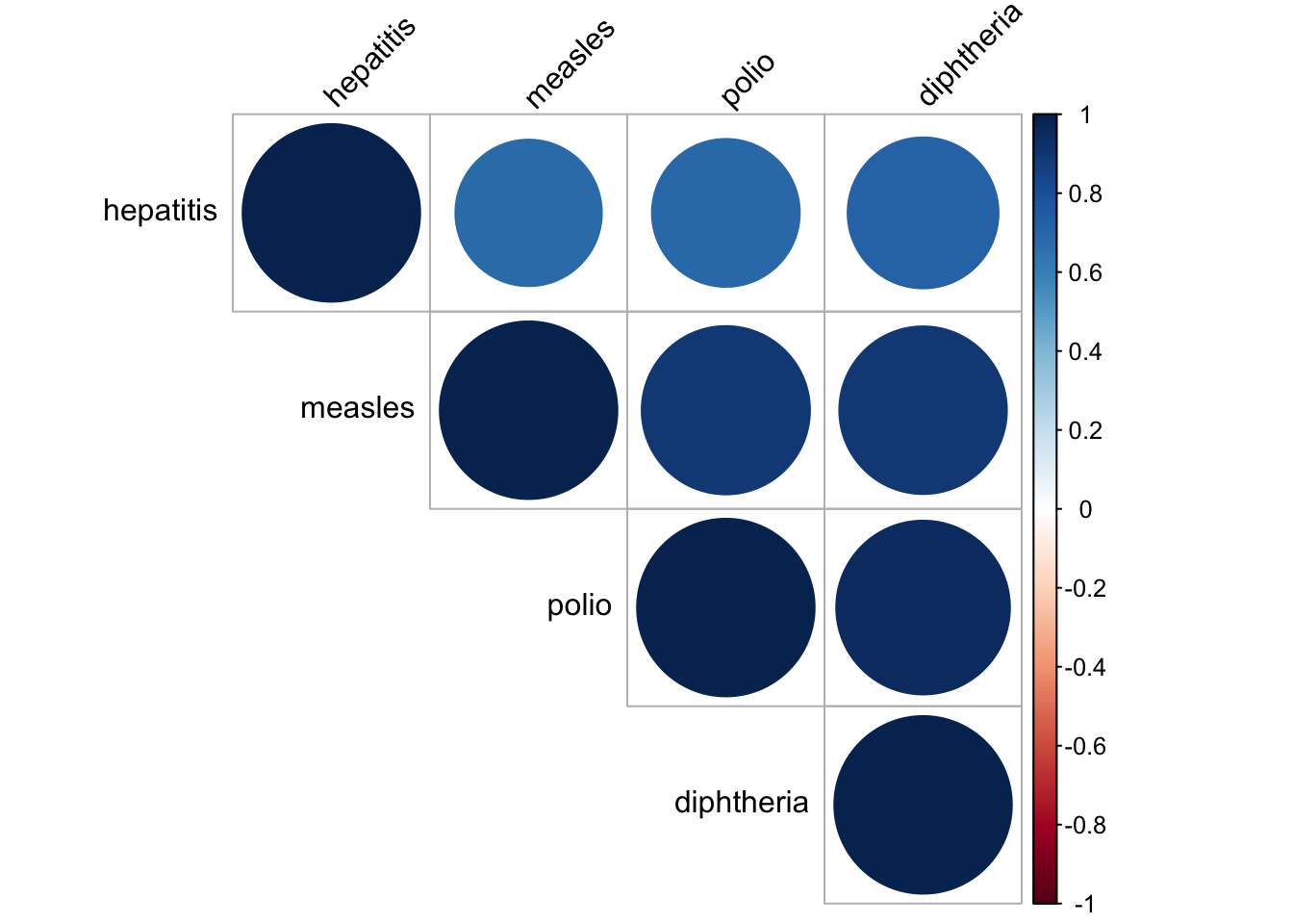
In our dataset, we have a lot of vaccinations for different diseases. Therefore, it is natural to check whether the vaccinations data are correlated to each other. It seems like they are all very correlated to each other, with correlation value higher than 0.6. In consequence, we decide to only choose vaccinations for measles as our chosen vector as it was one of the most common disease and now almost fully controled by vaccination. There is still some cases remain for the people that did not get vaccinated according to CDC website.
obe_thin_correlation = merged_data %>%
  select(age5_19thinness, age5_19obesity,bmi) %>%
  na.omit()
res = cor(obe_thin_correlation)
res
## age5_19thinness age5_19obesity bmi
## age5_19thinness 1.00 -0.55 -0.69
## age5_19obesity -0.55 1.00 0.81
## bmi -0.69 0.81 1.00corrplot(res, type = "upper", order = "hclust",
tl.col = "black", tl.srt = 45)
BMI, Thinness and obesity are three variables measuring similar characteristics. Ideally, people that are thinner, is less likely to have obesity and a lower bmi value. Therefore, I make corelation heat map and it turns out that the three variables are quite correlated, with a value around -0.55. For the prevention of multi-colinearity, I choose bmi only in our analysis as it is more meaningful. A BMI value greater than 25 is classified as obesity based on BMI Journal and it is one of the problem that exists among people. Cardiomyopathy, for instance, is one of the leading problem due to obesity in recent years by Benoit et. al.. Thus, we want to figure out if bmi can be used to predict life expectancy and whether a high bmi do lead to a decrease in life expectancy.
Correlation and Scatter Plot:
Visualization via scatter plot is a way to further discover the pairwise relation between two chosen variable. By plotting the scatter plot and fitted using best linear line, we can potential obtain the relationship between variables and how well linear trend can explain the data. Since we choose Life expectancy as our response variable, we can plot the scatter plot between life expectancy and other chosen predictors to see the correlation between variables.
# alcohol
merged_data_temp =
merged_data %>%
  select(year, une_life, alcohol) %>%
  filter(year > 2012)


myplots <- vector('list', 4)
for (i in 2013:2016){
    myplots[[i-2012]] =
      merged_data_temp %>%
      filter(year == i) %>%
      ggplot(aes(x = alcohol, y = une_life))+geom_point()+geom_smooth(method = 'lm', se = TRUE, color = 'red')+
      labs(title = sprintf("year %s", i))

  }

plot_row1 <- plot_grid(myplots[[1]], myplots[[2]])
plot_row2 <- plot_grid(myplots[[3]], myplots[[4]])
# title
title <- ggdraw() +
  draw_label(
    "Scatter Plot for Life Expectancy and alcohol",
    fontface = 'bold',
    x = 0,
    hjust = 0
  ) +
  theme(
    # add margin on the left of the drawing canvas,
    # so title is aligned with left edge of first plot
    plot.margin = margin(0, 0, 0, 7)
  )


plot_grid(title,plot_row1,plot_row2 ,ncol=1,  label_size = 12,rel_heights=c(0.1, 1,1))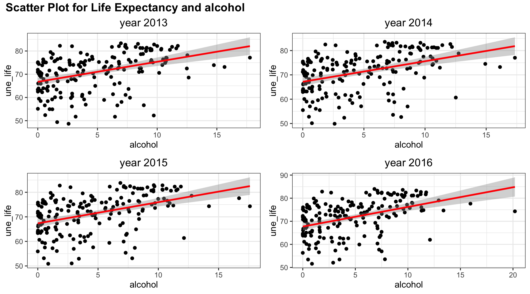
Among four years, the trend of relation between life expectancy and alcohol are similar. Although the line of best fit split points into an evenly two parts, there are more points with low alcohol values. And linear trend may not fully explain such relation.
#bmi
merged_data_temp =
merged_data %>%
  select(year, une_life, bmi) %>%
  filter(year > 2012)


myplots <- vector('list', 4)
for (i in 2013:2016){
    myplots[[i-2012]] =
      merged_data_temp %>%
      filter(year == i) %>%
      ggplot(aes(x = bmi, y = une_life))+geom_point()+geom_smooth(method = 'lm', se = TRUE, color = 'red')+
      labs(title = sprintf("year %s", i))

  }

plot_row1 <- plot_grid(myplots[[1]], myplots[[2]])
plot_row2 <- plot_grid(myplots[[3]], myplots[[4]])
# title
title <- ggdraw() +
  draw_label(
    "Scatter Plot for Life Expectancy and bmi",
    fontface = 'bold',
    x = 0,
    hjust = 0
  ) +
  theme(
    # add margin on the left of the drawing canvas,
    # so title is aligned with left edge of first plot
    plot.margin = margin(0, 0, 0, 7)
  )


plot_grid(title,plot_row1,plot_row2 ,ncol=1,  label_size = 12,rel_heights=c(0.1, 1,1))
Bmi has a positive correlation with life expectancy as shown in the plots, and the points for the four years are almost exactly the same. Linear trend seems to explain the relation well as suggested in the scatter plots. When bmi increases, the life expectancy is likely to have a higher value, although we cannot check the causation in behind.
#measles
merged_data_temp =
merged_data %>%
  select(year, une_life, measles) %>%
  filter(year > 2012)


myplots <- vector('list', 4)
for (i in 2013:2016){
    myplots[[i-2012]] =
      merged_data_temp %>%
      filter(year == i) %>%
      ggplot(aes(x = measles, y = une_life))+geom_point()+geom_smooth(method = 'lm', se = TRUE, color = 'red')+
      labs(title = sprintf("year %s", i))

  }

plot_row1 <- plot_grid(myplots[[1]], myplots[[2]])
plot_row2 <- plot_grid(myplots[[3]], myplots[[4]])
# title
title <- ggdraw() +
  draw_label(
    "Scatter Plot for Life Expectancy and measles",
    fontface = 'bold',
    x = 0,
    hjust = 0
  ) +
  theme(
    # add margin on the left of the drawing canvas,
    # so title is aligned with left edge of first plot
    plot.margin = margin(0, 0, 0, 7)
  )


plot_grid(title,plot_row1,plot_row2 ,ncol=1,  label_size = 12,rel_heights=c(0.1, 1,1))
Measle vaccination coverage seems to indicate a high life expectancy when vaccination coverage is high. But such relation may be non linear as there are lots of values clustered in the upper right corner.
#obesity
merged_data_temp =
merged_data %>%
  select(year, une_life, age5_19obesity) %>%
  filter(year > 2012)


myplots <- vector('list', 4)
for (i in 2013:2016){
    myplots[[i-2012]] =
      merged_data_temp %>%
      filter(year == i) %>%
      ggplot(aes(x = age5_19obesity, y = une_life))+geom_point()+geom_smooth(method = 'lm', se = TRUE, color = 'red')+
      labs(title = sprintf("year %s", i))

  }

plot_row1 <- plot_grid(myplots[[1]], myplots[[2]])
plot_row2 <- plot_grid(myplots[[3]], myplots[[4]])
# title
title <- ggdraw() +
  draw_label(
    "Scatter Plot for Life Expectancy and obesity among age 5-19",
    fontface = 'bold',
    x = 0,
    hjust = 0
  ) +
  theme(
    # add margin on the left of the drawing canvas,
    # so title is aligned with left edge of first plot
    plot.margin = margin(0, 0, 0, 7)
  )


plot_grid(title,plot_row1,plot_row2 ,ncol=1,  label_size = 12,rel_heights=c(0.1, 1,1))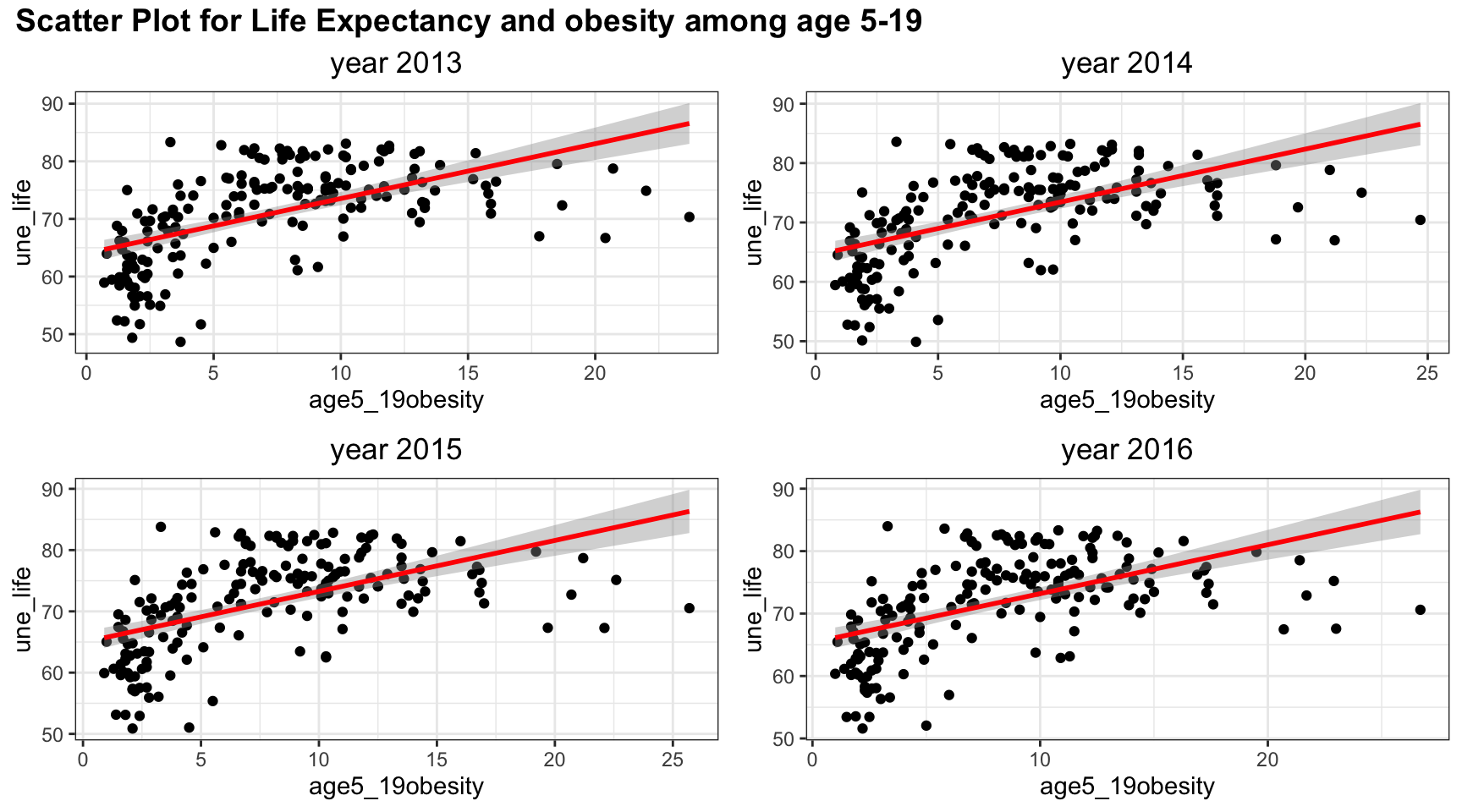
Although linear trend works well in the scatter plot between obesity and life expectancy, the points suggests a non-linear, perhaps a quadratic trends, in the graph. There is clearly a “r” shape pattern in the graph. Similar to other plots, the four years have almost the same scatter plot.
#basic_water
merged_data_temp =
merged_data %>%
  select(year, une_life, basic_water) %>%
  filter(year > 2012)


myplots <- vector('list', 4)
for (i in 2013:2016){
    myplots[[i-2012]] =
      merged_data_temp %>%
      filter(year == i) %>%
      ggplot(aes(x = basic_water, y = une_life))+geom_point()+geom_smooth(method = 'lm', se = TRUE, color = 'red')+
      labs(title = sprintf("year %s", i))

  }

plot_row1 <- plot_grid(myplots[[1]], myplots[[2]])
plot_row2 <- plot_grid(myplots[[3]], myplots[[4]])
# title
title <- ggdraw() +
  draw_label(
    "Scatter Plot for Life Expectancy and percentag of people access to basic water ",
    fontface = 'bold',
    x = 0,
    hjust = 0
  ) +
  theme(
    # add margin on the left of the drawing canvas,
    # so title is aligned with left edge of first plot
    plot.margin = margin(0, 0, 0, 7)
  )


plot_grid(title,plot_row1,plot_row2 ,ncol=1,  label_size = 12,rel_heights=c(0.1, 1,1))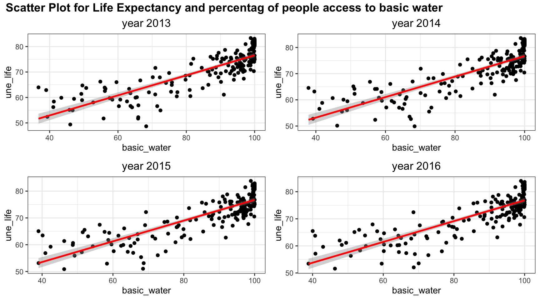
Linear trends fit the relation between Life Expectancy and percentag of people access to basic water well. There is clearly an upward increasing trend.
# doctors
merged_data_temp =
merged_data %>%
  select(year, une_life, doctors) %>%
  filter(year > 2012)


myplots <- vector('list', 4)
for (i in 2013:2016){
    myplots[[i-2012]] =
      merged_data_temp %>%
      filter(year == i) %>%
      ggplot(aes(x = doctors, y = une_life))+geom_point()+geom_smooth(method = 'lm', se = TRUE, color = 'red')+
      labs(title = sprintf("year %s", i))

  }

plot_row1 <- plot_grid(myplots[[1]], myplots[[2]])
plot_row2 <- plot_grid(myplots[[3]], myplots[[4]])
# title
title <- ggdraw() +
  draw_label(
    "Scatter Plot for Life Expectancy and doctors",
    fontface = 'bold',
    x = 0,
    hjust = 0
  ) +
  theme(
    # add margin on the left of the drawing canvas,
    # so title is aligned with left edge of first plot
    plot.margin = margin(0, 0, 0, 7)
  )


plot_grid(title,plot_row1,plot_row2 ,ncol=1,  label_size = 12,rel_heights=c(0.1, 1,1))
Similar to obesity, the graph has a “r” pattern and thus, there exist a non linear correlation. Thus, linear relation may not be accurate to explain the association. However, the linear trend do include most of the information, so it might be sufficient to just use linear relation. We will check it further in later analysis.
#une_edu_spend
merged_data_temp =
merged_data %>%
  select(year, une_life, une_edu_spend) %>%
  filter(year > 2012)


myplots <- vector('list', 4)
for (i in 2013:2016){
    myplots[[i-2012]] =
      merged_data_temp %>%
      filter(year == i) %>%
      ggplot(aes(x = une_edu_spend, y = une_life))+geom_point()+geom_smooth(method = 'lm', se = TRUE, color = 'red')+
      labs(title = sprintf("year %s", i))

  }

plot_row1 <- plot_grid(myplots[[1]], myplots[[2]])
plot_row2 <- plot_grid(myplots[[3]], myplots[[4]])
# title
title <- ggdraw() +
  draw_label(
    "Scatter Plot for Life Expectancy and education expenditure",
    fontface = 'bold',
    x = 0,
    hjust = 0
  ) +
  theme(
    # add margin on the left of the drawing canvas,
    # so title is aligned with left edge of first plot
    plot.margin = margin(0, 0, 0, 7)
  )


plot_grid(title,plot_row1,plot_row2 ,ncol=1,  label_size = 12,rel_heights=c(0.1, 1,1))
The expenditure also suggest a linear increasing trend for all years. Year 2015 seems to have an outlier with a very high education expenditure. Otherwise, the pattern is similar for the four years. The scatter plot is quite spread out, so there may be some indication of non linear trend but we cannot conclude from the scatter plot.
# une_gni
merged_data_temp =
merged_data %>%
  select(year, une_life, une_gni) %>%
  filter(year > 2012)


myplots <- vector('list', 4)
for (i in 2013:2016){
    myplots[[i-2012]] =
      merged_data_temp %>%
      filter(year == i) %>%
      ggplot(aes(x = une_gni, y = une_life))+geom_point()+geom_smooth(method = 'lm', se = TRUE, color = 'red')+
      labs(title = sprintf("year %s", i))

  }

plot_row1 <- plot_grid(myplots[[1]], myplots[[2]])
plot_row2 <- plot_grid(myplots[[3]], myplots[[4]])
# title
title <- ggdraw() +
  draw_label(
    "Scatter Plot for Life Expectancy and GNI per capita",
    fontface = 'bold',
    x = 0,
    hjust = 0
  ) +
  theme(
    # add margin on the left of the drawing canvas,
    # so title is aligned with left edge of first plot
    plot.margin = margin(0, 0, 0, 7)
  )


plot_grid(title,plot_row1,plot_row2 ,ncol=1,  label_size = 12,rel_heights=c(0.1, 1,1))
The association between life expectancy and GNI per capita also shows a non-linear correlation with a “r” patter. Therefore, non-linear correlation analysis may be needed.
#une_pop
merged_data_temp =
merged_data %>%
  select(year, une_life, une_pop) %>%
  filter(year > 2012)


myplots <- vector('list', 4)
for (i in 2013:2016){
    myplots[[i-2012]] =
      merged_data_temp %>%
      filter(year == i) %>%
      ggplot(aes(x = une_pop, y = une_life))+geom_point()+geom_smooth(method = 'lm', se = TRUE, color = 'red')+
      labs(title = sprintf("year %s", i))

  }

plot_row1 <- plot_grid(myplots[[1]], myplots[[2]])
plot_row2 <- plot_grid(myplots[[3]], myplots[[4]])
# title
title <- ggdraw() +
  draw_label(
    "Scatter Plot for Life Expectancy and Population",
    fontface = 'bold',
    x = 0,
    hjust = 0
  ) +
  theme(
    # add margin on the left of the drawing canvas,
    # so title is aligned with left edge of first plot
    plot.margin = margin(0, 0, 0, 7)
  )


plot_grid(title,plot_row1,plot_row2 ,ncol=1,  label_size = 12,rel_heights=c(0.1, 1,1))
As seen in the scatter plot, population is not very correlated to life expectancy and the data are very focused on low population. A linear relation is not quite appropriate here.
#une_literacy
merged_data_temp =
merged_data %>%
  select(year, une_life, une_literacy) %>%
  filter(year > 2012)


myplots <- vector('list', 4)
for (i in 2013:2016){
    myplots[[i-2012]] =
      merged_data_temp %>%
      filter(year == i) %>%
      ggplot(aes(x = une_literacy, y = une_life))+geom_point()+geom_smooth(method = 'lm', se = TRUE, color = 'red')+
      labs(title = sprintf("year %s", i))

  }

plot_row1 <- plot_grid(myplots[[1]], myplots[[2]])
plot_row2 <- plot_grid(myplots[[3]], myplots[[4]])
# title
title <- ggdraw() +
  draw_label(
    "Scatter Plot for Life Expectancy and Literacy Coverage",
    fontface = 'bold',
    x = 0,
    hjust = 0
  ) +
  theme(
    # add margin on the left of the drawing canvas,
    # so title is aligned with left edge of first plot
    plot.margin = margin(0, 0, 0, 7)
  )


plot_grid(title,plot_row1,plot_row2 ,ncol=1,  label_size = 12,rel_heights=c(0.1, 1,1))
Due to the missing values, literacy coverage does not have a lot of details. But linear trend do explain the over all association between life expectancy and percentage of people who are able to write and speak a language.
# PM_value
merged_data_temp =
merged_data %>%
  select(year, une_life, PM_value) %>%
  filter(year > 2012)


myplots <- vector('list', 4)
for (i in 2013:2016){
    myplots[[i-2012]] =
      merged_data_temp %>%
      filter(year == i) %>%
      ggplot(aes(x = PM_value, y = une_life))+geom_point()+geom_smooth(method = 'lm', se = TRUE, color = 'red')+
      labs(title = sprintf("year %s", i))

  }

plot_row1 <- plot_grid(myplots[[1]], myplots[[2]])
plot_row2 <- plot_grid(myplots[[3]], myplots[[4]])
# title
title <- ggdraw() +
  draw_label(
    "Scatter Plot for Life Expectancy and percentage of people exposed to abnormal PM level",
    fontface = 'bold',
    x = 0,
    hjust = 0
  ) +
  theme(
    # add margin on the left of the drawing canvas,
    # so title is aligned with left edge of first plot
    plot.margin = margin(0, 0, 0, 7)
  )


plot_grid(title,plot_row1,plot_row2 ,ncol=1,  label_size = 12,rel_heights=c(0.1, 1,1))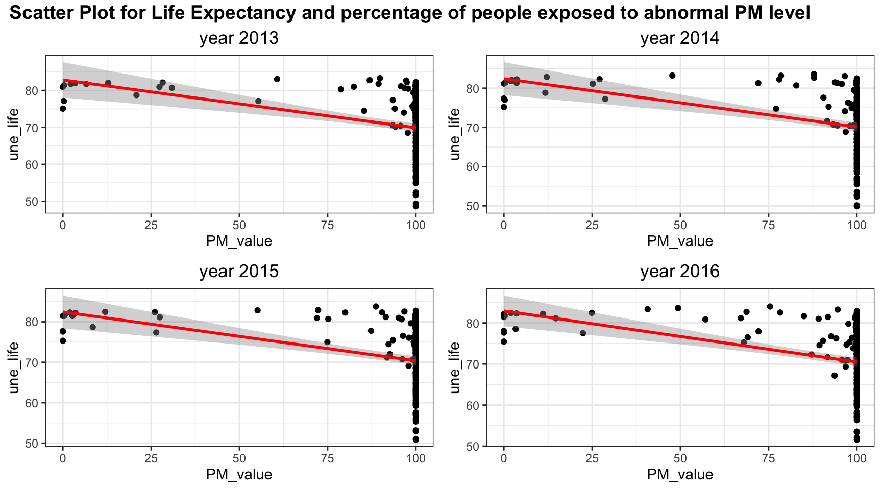
Since most of people are exposed to abnormal PM level, most of the PM value is clustered at 100. Linear relation may be sufficient to explain lower PM values but it may be difficult to include all the information for high PM value.
#gghe_d
merged_data_temp =
merged_data %>%
  select(year, une_life, gghe_d) %>%
  filter(year > 2012)


myplots <- vector('list', 4)
for (i in 2013:2016){
    myplots[[i-2012]] =
      merged_data_temp %>%
      filter(year == i) %>%
      ggplot(aes(x = gghe_d, y = une_life))+geom_point()+geom_smooth(method = 'lm', se = TRUE, color = 'red')+
      labs(title = sprintf("year %s", i))

  }

plot_row1 <- plot_grid(myplots[[1]], myplots[[2]])
plot_row2 <- plot_grid(myplots[[3]], myplots[[4]])
# title
title <- ggdraw() +
  draw_label(
    "Scatter Plot for Life Expectancy and Health expenditure",
    fontface = 'bold',
    x = 0,
    hjust = 0
  ) +
  theme(
    # add margin on the left of the drawing canvas,
    # so title is aligned with left edge of first plot
    plot.margin = margin(0, 0, 0, 7)
  )


plot_grid(title,plot_row1,plot_row2 ,ncol=1,  label_size = 12,rel_heights=c(0.1, 1,1))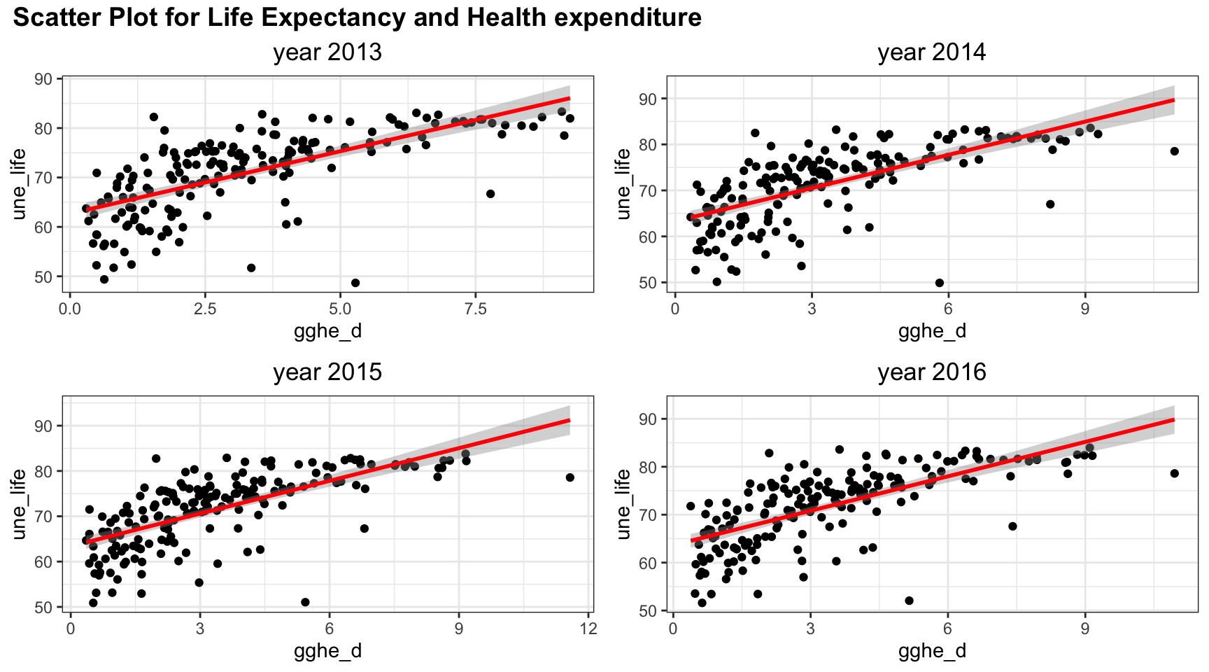
Health expenditure is positively correlated with life expectancy. However, there may be non linear trend as there is a curve bending at health expenditure = 3% of GDP.
Correlation:
Although scatter plot gives us some visualization of correlation between variables, we can not know to what extend the two variables are correlated. Therefore, correlation, as a numeric value, is of a great help to resolve the problem. The correlation value gives us a value that indicates how correlated two variables are using Pearson method or distance methods.
Pearson Correlation
Theory
Pearson correlation is a common EDA method that measures the strength of the linear relation between two variables paper. It has the formula defined in following definition:
Definition Pearson
Let x and y be two random variables with zero mean and \(x,y\in \mathbb R\), the pearson correlation coefficient is defined as:
\[ \rho (x,y) = \frac{cov(x,y)}{\sigma_x\sigma_y} \]
where \(\sigma_x=\sqrt{var(x)}\) and \(\sigma_y=\sqrt{var(y)}\).
The coefficient as a value between \(-1\leq\rho(x,y)\leq1\). If the coefficient is zero, then x and y does not have correlation at all. If the coefficient is closer to a value of +1 or -1, then the correlation between the two variable is stronger. A +1 coefficient means the two variables have a perfect positive correlation whereas a -1 value means the two variables have a perfect negative correlation.
Results
Over the time:
Pearson_Correlation = function(varnum, merged_data){

  correlation_result = tibble("date"=2000:2016, "Pearson_cor"=0,"Pearson_pval"=0)

  for (t in 2000:2016){
    merged_data_temp =
      merged_data %>%
      filter(year==t)

    correlation_result$Pearson_cor[t-1999] =
    round(cor(merged_data_temp[,varnum], merged_data_temp$une_life, method = "pearson",use = "complete.obs")[1],2)

    correlation_result$Pearson_pval[t-1999] =
    round(cor.test(merged_data_temp[,varnum][[1]], merged_data_temp$une_life, method = "pearson",use = "complete.obs")$p.value,2)

  }

  return(correlation_result)

}

#Pearson_Correlation(6,merged_data)

Pearson_Correlation_result = tibble("date"=2000:2016)


colname = colnames(merged_data)


Pearson_Corr_res =
Pearson_Correlation_result %>%
  mutate(mortality = Pearson_Correlation(8,merged_data)$Pearson_cor,
         alcohol = Pearson_Correlation(11,merged_data)$Pearson_cor,
         bmi = Pearson_Correlation(12,merged_data)$Pearson_cor,
         obesity = Pearson_Correlation(14,merged_data)$Pearson_cor,
         measles = Pearson_Correlation(16,merged_data)$Pearson_cor,
         water = Pearson_Correlation(19,merged_data)$Pearson_cor,
         doctors = Pearson_Correlation(20,merged_data)$Pearson_cor,
         )

Pearson_Corr_res2 =
Pearson_Correlation_result %>%
  mutate(edu_expenditure = Pearson_Correlation(31,merged_data)$Pearson_cor,
         gni_capita = Pearson_Correlation(29,merged_data)$Pearson_cor,
         population = Pearson_Correlation(25,merged_data)$Pearson_cor,
         literacy = Pearson_Correlation(32,merged_data)$Pearson_cor,
         #PM_value = Pearson_Correlation(34,merged_data)$Pearson_cor,
         health_expenditure = Pearson_Correlation(23,merged_data)$Pearson_cor)

Pearson_Corr_pval =
Pearson_Correlation_result %>%
  mutate(mortality = Pearson_Correlation(8,merged_data)$Pearson_pval,
         alcohol = Pearson_Correlation(11,merged_data)$Pearson_pval,
         bmi = Pearson_Correlation(12,merged_data)$Pearson_pval,
         obesity = Pearson_Correlation(14,merged_data)$Pearson_pval,
         measles = Pearson_Correlation(16,merged_data)$Pearson_pval,
         water = Pearson_Correlation(19,merged_data)$Pearson_pval,
         doctors = Pearson_Correlation(20,merged_data)$Pearson_pval,
         edu_expenditure = Pearson_Correlation(31,merged_data)$Pearson_pval,
         gni_capita = Pearson_Correlation(29,merged_data)$Pearson_pval,
         population = Pearson_Correlation(25,merged_data)$Pearson_pval,
         literacy = Pearson_Correlation(32,merged_data)$Pearson_pval,
         #PM_value = Pearson_Correlation(34,merged_data)$Pearson_pval,
         health_expenditure = Pearson_Correlation(23,merged_data)$Pearson_pval
         )


grid.table(Pearson_Corr_res)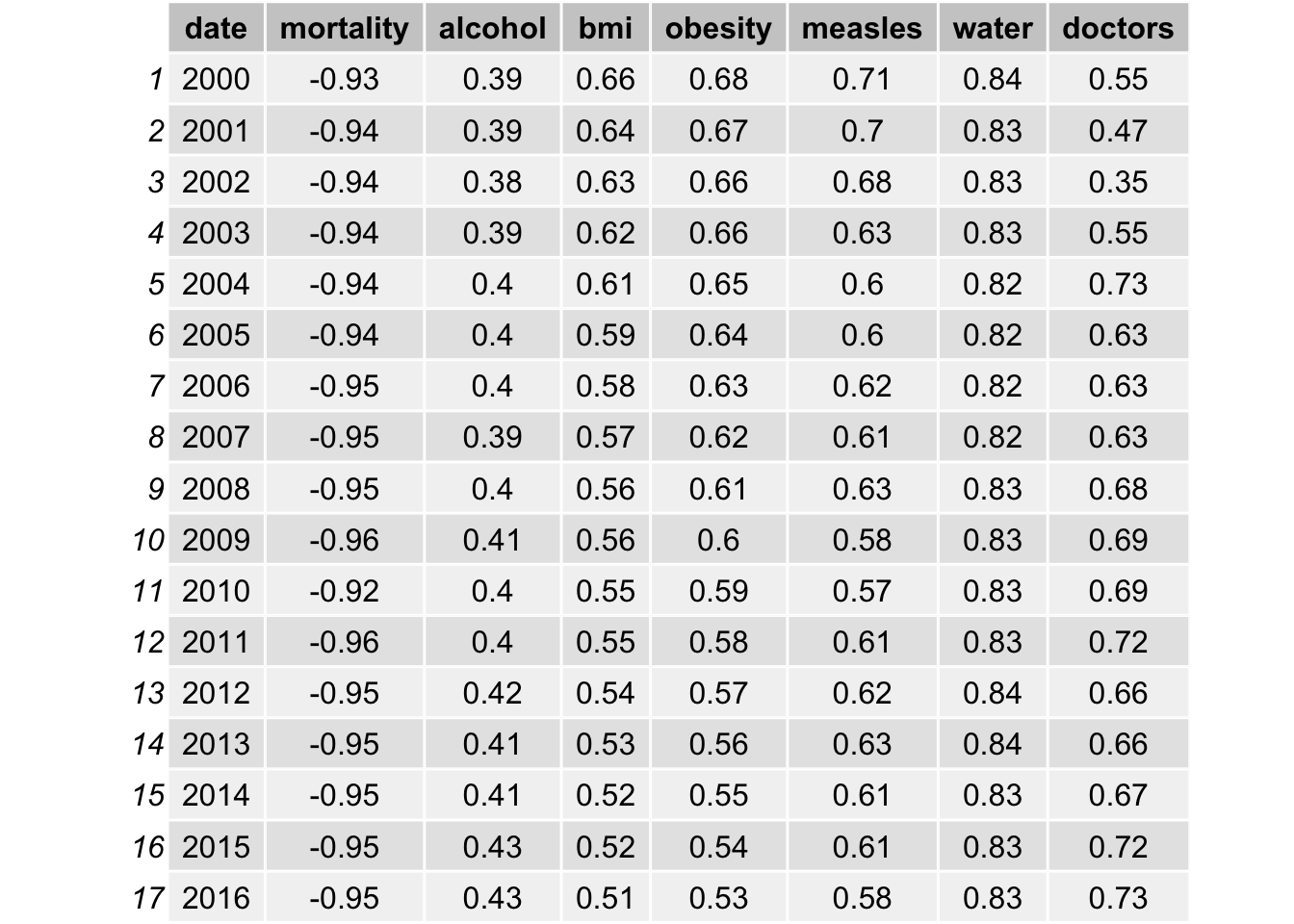
grid.table(Pearson_Corr_res2)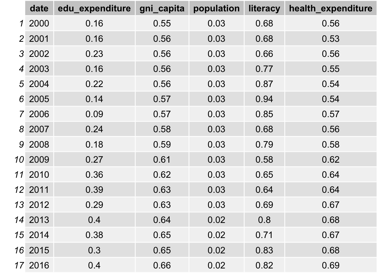
As indicated in the table, bmi, obesity, measles vaccination, gni per capita and health expenditure all have a high correlation with life expectancy, with a value close to 0.6. The correlation with water access and literacy is even higher, over 0.8 for all years. As discussed, life expectancy is calculated from mortality and therefore it has a really high correlation. We will not include such data. On the other hand, population is not likely to be correlated with life expectancy, as the correlations are all approximately 0.03.
Distance Correlation
Theory
Although Pearson Correlation may be sufficient to explore the association between variables and life expectancy, there is some non-linear trends exist between variables, such as obesity, GNI per capita, doctors, health expenditure, and life expectancy. Therefore, it is necessary to use a non-linear method to account for such scenarios.
Distance correlation is a novel developed technique to discover the joint dependence of random variables developed by Székely et al. Unlike Pearson correlation, such Pairwise distance correlation is a distance method and therefore it can take into consideration of the non-linear relationship between two random variables, namely \(X\in \mathbb{R}^p\) and \(Y\in \mathbb{R}^q\) that can have arbitrary dimensions (p and q can be non-equal) to some extend. The correlation between two variables is said to be independent of distance correlation \(\mathcal{R}(X,Y)=0\).
Denote the scalar product of two vectors \(a\) and \(b\) as <\(a,b\)> and conjugate of complex function f as \(f\). Also define norm \(|x|_p\) as Euclidean norm for \(x\in\mathbb{R}^p\)
Definition 1
In weighted \(l_2\) space, the \(||\cdot||_w\)-norm for any complex function \(\zeta \in \mathbb{R}^p\times\mathbb{R}^q\) is defined by: \[ \begin{equation} ||\zeta( a, b )||^2 _w =\int_{\mathbb{R}^{p+q}}|\zeta( a, b)|^2 w( a, b)\,d a\, d b \end{equation} \] where \(w(a,b)\) can be any arbitrary positive weighting function as long as the integral is well-defined.
Definition 2
Define the measure of dependence as: \[ \begin{equation} V^2(X,Y;w) = ||f_{X,Y}(a,b)-f_X(a)f_Y(b)||^2_w= \int_{\mathbb{R}^{p+q}}|f_{X,Y}(a,b)-f_X(a)f_Y(b)|^2 w( a, b)\,d a\, d b \end{equation} \]
Proof
The criterion of independent means that for vectors \(a\), \(b\), the probability density function \(f_X(a)\), \(f_Y(b)\) and their joint probability density function \(f_{X,Y}(a,b)\) satisfies \(f_{X,Y}(a,b)=f_X(a)f_Y(b)\). Therefore, I have \(V^2(X,Y;w)=||0||^2_w=0\) if they are independent hence the equation satisfy the condition that \(V^2=0\) only if variables are independent. (see paper)
The choice of weighting function must satisfy invariance under transformations of random variables up to multiplication of a positive constant \(\epsilon\): \((X,Y)\rightarrow (\epsilon X, \epsilon Y)\) and positiveness for any dependent variables. By the work of Szekely et. al., only non-integrable functions satisfy the condition for weight function. In order to specify the formula, I need the following lemma
Lemma 1
For all x in \(\mathbb{R}^d\): \[ \begin{equation} \int_{\mathbb{R}^d}\frac{1-cos<y,x> }{|y|^{d+1}_{d}}dy=c_d|x|=\frac{\pi ^{(1+d/2)}}{2 \Gamma ((d+1)/2)}|x| \end{equation} \] where \(\Gamma(\cdot)\) is the gamma function. This is proved by Szekely et. al.
Now I can choose weight function as following: \[ \begin{equation} w(a,b) = (c_p c_q |a| ^{1+p}_p |b| ^{1+q}_q )^{-1} \end{equation} \]
By using such weight function and lemma 3.1, the definition of distance covariance will be well-defined. Note by the weight, I have \(dw = (c_p c_q |a| ^{1+p}_p |b| ^{1+q}_q )^{-1}dadb\). This is proven in the following definition. \
Definition 4
Define the distance covariance (dCov) for random vectors \(X\) and \(Y\) with finite expectation as the following non-negative figure: \[ \begin{equation} V^2(X,Y) = ||f_{X,Y} (a,b)- f_X(a)f_Y (b)||^2 = \frac{1}{c_pc_q}\int_{\mathbb{R}^{p+q}}\frac{|f_{X,Y} (a,b) - f_X(a)f_Y (b)|^2}{|a|^{1+p}_p|b|^{1+q}_q}da db \end{equation} \] where \(a\in \mathbb{R}^p\), \(b\in \mathbb{R}^q\) are two vectors that \(a\in X\) and \(b\in Y\)
Different to the Pearson method, the distance correlation have a non-negative value as it is a distance method. Therefore, although we have a better ability to measure non-linear correlation, we cannot identify the direction of the correlation. In other word, we cannot tell whether the correlation is positively correlated or negatively correlated.
Result
Distance_Correlation = function(varnum, merged_data){

  correlation_result = tibble("date"=2000:2016, "Distance_cor"=0,"Distance_pval"=0)

  for (t in 2000:2016){
    merged_data_temp =
      merged_data %>%
      filter(year==t) %>%
      select(27,varnum) %>%
      na.omit()

    correlation_result$Distance_cor[t-1999] =
    round(dcor(merged_data_temp[,2], merged_data_temp$une_life,)[1],2)

    correlation_result$Distance_pval[t-1999] =
    round(dcor.test(merged_data_temp[,2][[1]], merged_data_temp$une_life,R=1000)$p.value,2)

  }

  return(correlation_result)

}


Distance_Correlation_result = tibble("date"=2000:2016)

colname = colnames(merged_data)

result_corr =
Distance_Correlation_result %>%
  mutate(mortality = Distance_Correlation(8,merged_data)$Distance_cor,
         alcohol = Distance_Correlation(11,merged_data)$Distance_cor,
         bmi = Distance_Correlation(12,merged_data)$Distance_cor,
         obesity = Distance_Correlation(14,merged_data)$Distance_cor,
         measles = Distance_Correlation(16,merged_data)$Distance_cor,
         water = Distance_Correlation(19,merged_data)$Distance_cor,
         doctors = Distance_Correlation(20,merged_data)$Distance_cor,
         )


result_corr2 =
Distance_Correlation_result %>%
  mutate(edu_expenditure = Distance_Correlation(31,merged_data)$Distance_cor,
         gni_capita = Distance_Correlation(29,merged_data)$Distance_cor,
         population = Distance_Correlation(25,merged_data)$Distance_cor,
         literacy = Distance_Correlation(32,merged_data)$Distance_cor,
         #PM_value = Distance_Correlation(34,merged_data)$Distance_cor,
         health_expenditure = Distance_Correlation(23,merged_data)$Distance_cor)


result_pval =
  Distance_Correlation_result %>%
  mutate(mortality = Distance_Correlation(8,merged_data)$Distance_pval,
         alcohol = Distance_Correlation(11,merged_data)$Distance_pval,
         bmi = Distance_Correlation(12,merged_data)$Distance_pval,
         obesity = Distance_Correlation(14,merged_data)$Distance_pval,
         measles = Distance_Correlation(16,merged_data)$Distance_pval,
         water = Distance_Correlation(19,merged_data)$Distance_pval,
         doctors = Distance_Correlation(20,merged_data)$Distance_pval,
         edu_expenditure = Distance_Correlation(31,merged_data)$Distance_pval,
         gni_capita = Distance_Correlation(29,merged_data)$Distance_pval,
         population = Distance_Correlation(25,merged_data)$Distance_pval,
         literacy = Distance_Correlation(32,merged_data)$Distance_pval,
         #PM_value = Distance_Correlation(34,merged_data)$Distance_pval,
         health_expenditure = Distance_Correlation(23,merged_data)$Distance_pval
         )


grid.table(result_corr)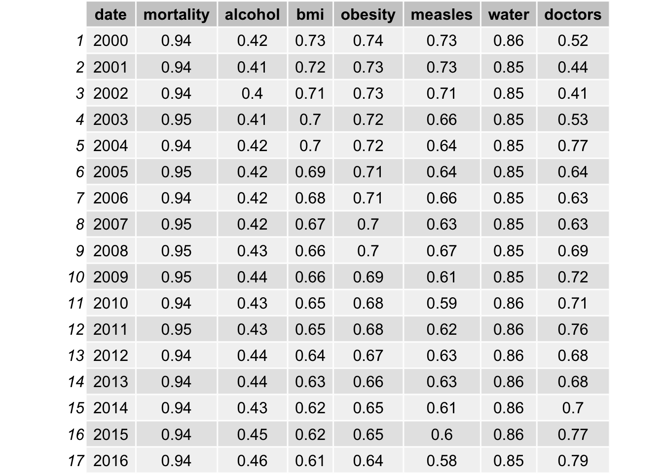
grid.table(result_corr2)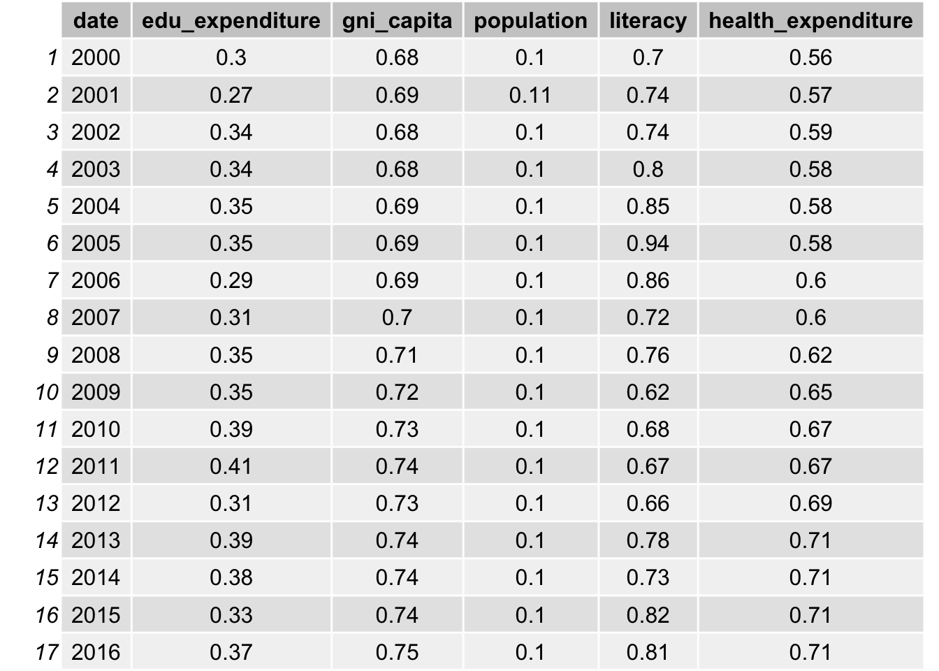
After take in consideration of non-linear trend, bmi, obesity, education expenditure, gni per capita has an average of approximately 0.07 increase in the correlation. Population also increases from 0.03 to 0.1. Such increase is not significant because high correlation values are still highly correlated. Therefore, it provides some evidence that linear model may be sufficient to use in our data analysis.