Analysis
1. Life Expectation by Regions
data %>%
  janitor::clean_names() %>%
  group_by(region) %>%
  summarise(avg_by_region = mean(une_life,na.rm = T)) %>%
  arrange(avg_by_region) %>%
knitr::kable(digits = 3)| region | avg_by_region |
|---|---|
| Africa | 57.070 |
| South-East Asia | 68.754 |
| Eastern Mediterranean | 70.070 |
| Western Pacific | 71.604 |
| Americas | 73.347 |
| Europe | 75.700 |
The table shows the arranged average life expectancy of each region from 2000 to 2016.
The range of average life expectancy among regions is about 8 years.
Europe has the highest average life expectancy while Africa has the lowest.
data %>%
  janitor::clean_names() %>%
  group_by(region) %>%
  ggplot(aes(x = fct_reorder(region,une_life), y = une_life, fill = region)) +
  geom_boxplot() +
  labs(title = "Boxplot of Life Expectancy by Regions") +
  xlab("Region") +
  ylab("Life Expectancy") +
  theme(axis.text.x = element_text(hjust = 1, angle = 10,size = 8))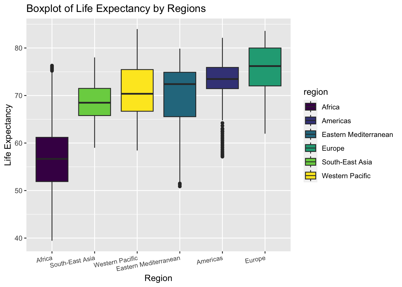
The boxplot shows the distribution of life expectancy in each region.
The variance of life expectancy is higher in Eastern Mediterranean and Africa.
The Americas has many outliers with low life expectancy
We can roughly tell from the plot that the variances of life expectancy among regions are not equal. Thus, we may perform a statistical test to check heteroscedasticity
test of equal variances
\[H_0: Equal\ \ variance \ \ among\ \ regions \ \text { vs } \ H_1: Unequal\ \ variance \]
bartlett.test(une_life ~ factor(region),data = data) %>%
  broom::tidy() %>%
knitr::kable()| statistic | p.value | parameter | method |
|---|---|---|---|
| 318.8595 | 0 | 5 | Bartlett test of homogeneity of variances |
The null hypothesis for Bartlett test is that the variances are equal. The result shows that the p-value is less than 0.05. Thus, we may reject the null and conclude that the variances of life expectancy among different regions is not equal. Consequently, we cannot perform ANOVA to test the difference of mean life expectancy in all the six regions. We should perform t.test between two selected regions separately.
2. t.test : Compare Mean Life Expectancy Between Americas and Europe
From the boxplot above, we find that the life expectancy in Americas and Europe distribute almost in the same interval. Though the median of Europe is higher, the variance in Americas seems smaller. Thus, we want to study if the mean life expectancy in the two regions are significantly different.
extract life expectancy in Americas and Europe
Americas <- data %>%
  janitor::clean_names() %>%
  filter(region == "Americas") %>%
  pull(une_life)


Europe <- data %>%
  janitor::clean_names() %>%
  filter(region == "Europe") %>%
  pull(une_life)
In order to decide on which type of t.test we should perform, we need to compare the variance in Americas and Europe first.
We can roughly tell from the boxplot that Americas has a smaller variance. But there also exist many outliers with low life expectancy values in Americas. Thus, we turn to statistical test to decide on the relationship.
test equal variance
\[H_0: \sigma^2_{Americas} =\ \sigma^2_{Europe}\ \text { vs } \ H_1: \sigma^2_{Americas} \neq\ \sigma^2_{Europe} \]
var.test(Americas,Europe,alternative = "two.sided",conf.level = 0.95) %>%
  broom::tidy() %>%
  knitr::kable()
## Multiple parameters; naming those columns num.df, den.df| estimate | num.df | den.df | statistic | p.value | conf.low | conf.high | method | alternative |
|---|---|---|---|---|---|---|---|---|
| 0.7259117 | 560 | 849 | 0.7259117 | 4.12e-05 | 0.6248981 | 0.8452553 | F test to compare two variances | two.sided |
The null hypothesis for the variance test is that the two variance are equal. The result shows that the p-value is much less than 0.05. Thus, we may reject the null hypothesis and conclude that the variances are not equal. Next, we should perform 2 sample t.test with unknown and unequal variance.
2 sample t.test with unknown unequal variances
\[H_0: \text{mean life_exp}_{Americas} = \ \text{mean life_exp}_{Europe}\ \text { vs } \ H_1: \text{mean life_exp}_{Americas} \neq \text{mean life_exp}_{Europe} \]
t.test(Americas,Europe,alternative = "less",conf.level = 0.95,paired = F,var.equal = FALSE ) %>%
  broom::tidy() %>%
knitr::kable()| estimate | estimate1 | estimate2 | statistic | p.value | parameter | conf.low | conf.high | method | alternative |
|---|---|---|---|---|---|---|---|---|---|
| -2.352754 | 73.34729 | 75.70004 | -9.837228 | 0 | 1320.964 | -Inf | -1.959081 | Welch Two Sample t-test | less |
The null hypothesis for the t.test is that the two variance are equal. The result shows that the p-value is much less than 0.05. Thus, we may reject the null hypothesis and conclude that the mean of life expectancy in Americas and Europe are different. Since the test statistics is negative, we know that mean life expectancy in Americas is smaller than Europe.
3. prop.test : Compare the Proportion of Life Expectancy Over 70 Between Western Pacific and South-East Asia
We can tell from the boxplot above that the boxes of Western Pacific and South-East Asia are almost overlapping. The majority of them seem to be over 65 years. Thus we are interested in comparing the proportion of life expectancy over 65 year in the two regions.
\[H_0: \text{Proportion}_{Western\ Pacific} = \ \text{Proportion}_{South-East\ Asia}\ \text { vs } \ H_1: \text{mean life_exp}_{Western\ Pacific} \neq \text{mean life_exp}_{South-East\ Asia} \]
data %>%
  janitor::clean_names() %>%
  filter(region == "Western Pacific") %>%
  summarise(above_65 = sum(une_life > 65),
            total = n()) %>%
knitr::kable()| above_65 | total |
|---|---|
| 304 | 357 |
data %>%
  janitor::clean_names() %>%
  filter(region == "South-East Asia")  %>%
  summarise(above_65 = sum(une_life > 65),
            total = n()) %>%
knitr::kable()| above_65 | total |
|---|---|
| 149 | 187 |
prop.test(c(304,149),n = c(357,187),correct = F) %>%
  broom::tidy() %>%
knitr::kable()| estimate1 | estimate2 | statistic | p.value | parameter | conf.low | conf.high | method | alternative |
|---|---|---|---|---|---|---|---|---|
| 0.8515406 | 0.7967914 | 2.640731 | 0.1041556 | 1 | -0.0137086 | 0.1232069 | 2-sample test for equality of proportions without continuity correction | two.sided |
The null hypothesis for the prop.test is that the two proportions are equal. The result shows that the p-value is approximately 0.104. Thus, under the significance level of 0.05, we fail to reject the null. We have evidence that the proportion of life expectancy above 65 in Western Pacific is the same as in South-East Asia.
4. Average Life Expectancy by (region, year) Combination
data %>%
  janitor::clean_names() %>%
  group_by(region,year) %>%
  summarise(avg_by_year_region = mean(une_life,na.rm = T)) %>%
  pivot_wider(
    names_from = region,
    values_from = avg_by_year_region
  ) %>%
knitr::kable(digits = 3)| year | Africa | Americas | Eastern Mediterranean | Europe | South-East Asia | Western Pacific |
|---|---|---|---|---|---|---|
| 2000 | 52.816 | 71.661 | 68.080 | 73.602 | 64.851 | 69.400 |
| 2001 | 53.040 | 71.900 | 68.350 | 73.923 | 65.463 | 69.706 |
| 2002 | 53.294 | 72.129 | 68.619 | 74.072 | 66.068 | 69.995 |
| 2003 | 53.681 | 72.354 | 68.889 | 74.252 | 66.644 | 70.304 |
| 2004 | 54.192 | 72.580 | 69.159 | 74.642 | 67.181 | 70.611 |
| 2005 | 54.744 | 72.789 | 69.425 | 74.784 | 67.677 | 70.899 |
| 2006 | 55.385 | 72.994 | 69.684 | 75.063 | 68.134 | 71.175 |
| 2007 | 56.106 | 73.201 | 69.930 | 75.287 | 68.566 | 71.439 |
| 2008 | 56.840 | 73.395 | 70.161 | 75.613 | 68.983 | 71.692 |
| 2009 | 57.594 | 73.601 | 70.378 | 75.957 | 69.388 | 71.970 |
| 2010 | 58.343 | 73.796 | 70.585 | 76.255 | 69.780 | 72.185 |
| 2011 | 59.065 | 73.985 | 70.788 | 76.672 | 70.161 | 72.409 |
| 2012 | 59.807 | 74.170 | 70.993 | 76.863 | 70.526 | 72.657 |
| 2013 | 60.445 | 74.343 | 71.203 | 77.166 | 70.873 | 72.892 |
| 2014 | 61.062 | 74.512 | 71.420 | 77.483 | 71.204 | 73.113 |
| 2015 | 61.641 | 74.669 | 71.645 | 77.493 | 71.516 | 73.316 |
| 2016 | 62.131 | 74.826 | 71.875 | 77.773 | 71.809 | 73.504 |
data %>%
  janitor::clean_names() %>%
  group_by(region,year) %>%
  summarise(avg_by_year_region = mean(une_life,na.rm = T)) %>%
  ggplot(aes(x = year, y = avg_by_year_region, color = region)) +
  geom_line() + geom_point() + labs(title = "Average Life Expectancy by Region, Year") + ylab ("Average Life Expectancy")
- The table and line graph above show the descriptive statistics and overall trend.
- It is clearly shown in the plot that Africa has a much lower life expectancy than the other regions.
5. Life Expectancy by Income Level
data %>%
  janitor::clean_names()  %>%
  filter(!is.na(income_group)) %>%
  group_by(income_group) %>%
  summarise(avg_by_income = mean(une_life,na.rm = T)) %>%
  arrange(avg_by_income) %>%
knitr::kable(digits = 3)| income_group | avg_by_income |
|---|---|
| Low income | 56.798 |
| Lower middle income | 64.725 |
| Upper middle income | 70.861 |
| High income | 77.818 |
data %>%
  janitor::clean_names() %>%
  filter(!is.na(income_group)) %>%
  group_by(income_group) %>%
  ggplot(aes(x = fct_reorder(income_group,une_life), y = une_life,fill = income_group)) +
  geom_boxplot() +
  labs(title = "Boxplot of Life Expectancy by Income Groups") +
  xlab("Income Groups") +
  ylab("Life Expectancy")
- The boxes of different income groups are almost not overlapping with each other.
- The pattern is clear that people from higher income group tend to have a higher life expectancy.
\[H_0: \sigma^2_{group \ i} =\ \sigma^2_{group \ j}\ \text { vs } \ H_1: \sigma^2_{group\ i} \neq\ \sigma^2_{group\ j} \]
- We have performed variance tests and conclude that the variances are not equal between any two groups. Since the method is similar to what we have used and displayed when studying the regional differences, we do not show the process here.
\[H_0: \text{mean life_exp}_{group \ i} = \ \text{mean life_exp}_{group \ j}\ \text { vs } \ H_1: \text{mean life_exp}_{group \ i} \neq \text{mean life_exp}_{group\ j} \]
- We have also performed 2 sample t.test to compare the mean life expectancy between groups. We conclude that the means are not equal between any two groups. Since the method is similar to what we have used and displayed when studying the regional differences, we do not show the process here.
6. Life Expectancy by Development Status
data %>%
  janitor::clean_names() %>%
  group_by(developed_developing_countries) %>%
  summarise(avg_by_dev = mean(une_life,na.rm = T)) %>%
knitr::kable(digits = 3)| developed_developing_countries | avg_by_dev |
|---|---|
| Developed | 77.403 |
| Developing | 66.122 |
data %>%
  janitor::clean_names() %>%
  group_by(developed_developing_countries) %>%
  ggplot(aes(x = developed_developing_countries, y = une_life,fill = developed_developing_countries)) +
  geom_boxplot() +
  labs(title = "Boxplot of Life Expectancy by Development Status") +
  xlab("Development Status") +
  ylab("Life Expectancy")
- The boxes of different development status are almost not overlapping with each other.
- The pattern is clear that people in developed countries tend to have a higher life expectancy.
\[H_0: \sigma^2_{developing} =\ \sigma^2_{developed}\ \text { vs } \ H_1: \sigma^2_{developing} \neq\ \sigma^2_{developed} \]
- We have performed variance test and conclude that the variances are not equal between the two categories. Since the method is similar to what we have used and displayed when studying the regional differences, we do not show the process here.
\[H_0: \text{mean life_exp}_{developing} = \ \text{mean life_exp}_{developed}\ \text { vs } \ H_1: \text{mean life_exp}_{developing} \neq \text{mean life_exp}_{developed} \]
- We have also performed 2 sample t.test to compare the mean life expectancy between the two groups. We conclude that the means are not equal. Since the method is similar to what we have used and displayed when studying the regional differences, we do not show the process here.
Summary
In this part, we applied statistical analysis to studying the differences in life expectancy caused by various factors. We first examine the distribution features and then choose appropriate tests to perform.
We draw the following conclusions from the tests and plots result :
Life expectancy in Americas and Europe have significantly different means.
Europe has the highest mean life expectancy in the world.
Africa has the lowest life expectancy in the world.
Western Pacific and South-East Asia has approximately the same proportion of life expectancy over 65.
Average life expectancy are significantly different among income groups and development status. People with higher income and from more developed countries tend to live longer.